
Content Writer & SEO Specialist
Content Writer & SEO Specialist
Aditya Sharma is a content writer at OptM Solutions specializing in automotive electronics, embedded systems, telematics, electric vehicle technologies, connected mobility, and autonomous driving technologies.
LinkedIn ProfileIn the modern software-defined vehicle (SDV), the driver's dashboard is no longer a static hardware array; it is a dynamic, high-performance edge-computing display that must communicate life-saving intelligence in a fraction of a second. As original equipment manufacturers (OEMs) abandon mechanical gauges in favor of fully digital panels, mastering automotive human-machine interface (HMI) design has become the defining differentiator for vehicle safety and brand identity.
For Tier 1 suppliers and embedded software engineers, executing premium instrument cluster UI/UX design is an exercise in extreme cognitive engineering. It requires perfectly balancing rich 3D graphical pipelines with strict functional safety mandates, ensuring the interface never overwhelms the driver. This definitive guide deconstructs the architecture, psychological principles, and software frameworks required to build safe, responsive, and automotive-grade digital cockpits in 2026.
What Is Instrument Cluster UI/UX Design?
Instrument cluster UI/UX design is the cognitive and visual engineering process of structuring an automotive digital dashboard to display real-time telemetry safely. It leverages cross-platform vector graphics engines, such as the Qt framework, to render speed, ADAS alerts, and battery metrics at a locked 60 frames per second, ensuring vital vehicle intelligence is conveyed with minimal driver distraction.
To fully grasp how these visual elements are rendered by the underlying silicon, we recommend first exploring our core guide on what is an instrument cluster and the hardware that drives it.
1. The Safety Mandate: Mitigating Cognitive Overload
The primary difference between designing a smartphone application and an automotive dashboard is the cost of failure. A confusing app layout frustrates a user; a confusing dashboard layout can cause a fatal highway accident.
The Distraction Crisis
As digital displays become larger and more complex, they introduce the severe risk of cognitive overload. According to research from the AAA Foundation for Traffic Safety, drivers interacting with poorly designed, overly complex in-vehicle infotainment or cluster screens can be visually and mentally distracted for more than 40 seconds when executing tasks. Taking your eyes off the road for even two seconds doubles the risk of a crash.
Consequently, the core mandate of automotive UI/UX is glanceability. The driver must be able to look down, extract the required metric (e.g., current speed or an active lane-departure warning), and return their eyes to the road within a strict 150-millisecond window.
Prioritization and Information Architecture
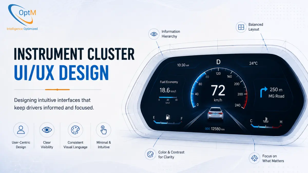
Because the screen real estate is limited, resolving challenges in instrument cluster development heavily involves information prioritization. Designers structure the interface using a strict hierarchy, where ASIL-rated safety alerts preempt all other visual elements.
- Primary Zone (Center): Current velocity, active ADAS collision warnings, and ASIL-critical telltales (e.g., ABS failure).
- Secondary Zone (Peripheral): Turn-by-turn navigation arrows, State of Charge (SoC), and trip analytics.
- Tertiary Zone (Minimized): Media track metadata, caller ID, and ambient temperature.
2. Visual Principles for Automotive Displays
Automotive UX relies on scientific visual principles to ensure readability across severe environmental conditions, including direct blinding sunlight and pitch-black rural highways.
Chromatic Strategy and Color Theory
In automotive safety, color is a highly regulated communication medium. The functions of instrument cluster UI rely on standardized semantic coloring:
- Red (#FF0000): Reserved exclusively for immediate danger or system failures (e.g., low brake fluid, engine overheating, collision warning).
- Yellow/Amber (#FFBF00): Indicates cautionary warnings or non-critical system faults (e.g., low tire pressure, check engine).
- Green/Blue: Used to indicate active, safe operational states (e.g., headlights on, cruise control engaged).
For OEM branding elements (such as startup animations or non-critical menus), designers integrate specific brand identity colors. For example, a premium B2B tech interface might utilize deep primary blues (#0278A0, #001941) paired with high-contrast electric green (#C2FB81) to maintain a sleek, minimalist aesthetic while preserving safety contrast ratios.
Typography and Kerning
Digital legibility degrades drastically under high-vibration driving conditions. Automotive UI strictly avoids serif fonts, utilizing clean, bold sans-serif typefaces with generous kerning (the space between letters). Font scaling is mapped to relative importance: the numerical speed readout is always the largest typographic element, allowing for instantaneous peripheral recognition.
3. Graphics Acceleration: The Qt Engine Advantage
A well-designed interface is useless if the underlying hardware cannot render it smoothly. The mechanical needles of legacy dashboards provided infinite fluidity. Digital displays must replicate that physical smoothness via software.
Vector Graphics vs. Bitmaps
Older components of instrument cluster systems relied on static bitmap images, which consumed vast amounts of memory and looked jagged when animated. Today, modern automotive UI is built using dynamic vector graphics.
The Qt and QML Framework
To bridge the gap between creative designers and embedded C++ engineers, the industry standard relies heavily on the Qt and QML frameworks.
- State Management: The UI layer receives raw CAN bus telemetry (e.g., RPM = 4500).
- Vector Calculation: The QML logic recalculates the geometry required to rotate the virtual tachometer needle to the precise angle.
- Hardware Acceleration: Qt issues draw calls directly to the System-on-Chip's (SoC) Graphics Processing Unit (GPU) using OpenGL ES.
- Rasterization: The GPU calculates anti-aliasing and shading, outputting the frame to the display panel.
This direct hardware acceleration allows the instrument cluster architecture to maintain a locked 60 frames per second (fps). Dropping below this frame rate causes visual stuttering, which subconsciously increases driver eye fatigue.
4. Dynamic Reconfiguration and Contextual Drive Modes
Because a digital dashboard is software-defined, it is not restricted to a single physical layout. The benefits of instrument cluster digitization include the ability to dynamically restructure the entire visual layout based on the vehicle's current operational context.
- Eco / Range Mode: The interface shifts to a calming green/blue palette. The traditional tachometer is replaced with an energy-flow visualization, showing the driver precisely when kinetic energy is being recaptured via regenerative braking to maximize EV range.
- Sport / Track Mode: The UI aggressively shifts to high-contrast red typography. The central focal point becomes a massive RPM gauge and numerical gear indicator, pushing non-essential data (like media) off the screen entirely.
- Autonomous / Highway Assist Mode: When ADAS features take over, the traditional speedometer shrinks. The center of the screen is replaced by a real-time, 3D sensor-fusion map showing the vehicle's position relative to surrounding highway traffic. This visual feedback builds trust, proving to the driver that the vehicle's sensors are actively tracking the environment.
5. Software Isolation and Functional Safety (ISO 26262)
The most complex aspect of automotive UX is ensuring that rich, heavy graphical animations never interfere with the rendering of critical safety alerts.
The role of embedded software in instrument clusters involves utilizing strict virtualization. A Type-1 bare-metal hypervisor splits the system's processor.
- The Safety Domain: Runs on a deterministic Real-Time Operating System (RTOS), controlling the speedometer and critical telltales.
- The Infotainment Domain: Runs on Embedded Linux or Android Automotive, rendering the complex 3D navigation maps.
If the 3D map rendering crashes due to a memory leak, the hypervisor ensures the RTOS remains completely unaffected. The driver will lose their map temporarily, but the critical velocity and braking alerts remain flawlessly visible. Understanding exactly how instrument cluster works reveals that this failsafe architecture is mandatory for achieving ISO 26262 ASIL (Automotive Safety Integrity Level) compliance.
6. Validating the UX: From Simulator to Silicon
A dashboard interface cannot be validated merely by looking at it on a designer's computer monitor. Before a UI is approved for production, it must undergo extreme stress profiling to ensure the hardware can render the design under load.
Hardware-in-the-Loop (HIL) Testing
During instrument cluster testing and validation, the physical cluster hardware is connected to HIL simulation racks. Engineers flood the cluster with thousands of simultaneous CAN network messages—simulating extreme braking, massive sensor faults, and sudden voltage drops.
The goal is to verify that the UI logic does not break under pressure. Does the Qt engine drop frames when forced to render a complex 3D map while simultaneously flashing an ABS warning? By validating the UI on actual automotive silicon, engineers guarantee ARAI-oriented deployment readiness.
Furthermore, flawless instrument cluster integration with ECUs, sensors and vehicle networks ensures that the latency between the physical wheel turning and the digital screen updating remains virtually imperceptible.
Transitioning from Concept to Automotive-Grade Reality
Executing world-class instrument cluster UI/UX design is a highly specialized discipline. It requires bridging the gap between stunning, driver-centric aesthetics and the unforgiving, deterministic realities of embedded vehicle safety. From managing cognitive load to deploying Qt-accelerated vector graphics over strict RTOS partitions, every pixel on a modern dashboard represents thousands of hours of architectural engineering.
For OEMs and Tier 1 suppliers aiming to deliver next-generation in-cabin experiences without the friction of building a software stack from the bare metal up, adopting a pre-engineered, production-ready platform is the ultimate strategic advantage.
If your organization is looking to integrate scalable, ASIL-compliant display topologies into your next generation of software-defined vehicles, explore OptM's production-ready Digital Instrument Cluster solutions. Our embedded engineering teams provide end-to-end integration—from custom Qt HMI development to ruggedized hardware architecture—ensuring your vehicle's most critical interface delivers uncompromised safety, fluidity, and performance.
Frequently Asked Questions
What is the 'glance concept' in automotive HMI design?
The glance concept is a usability benchmark requiring that a driver must look at the display panel, extract a vital status update, and refocus on the road environment within a maximum timeline of 150 milliseconds to preserve safety.
Why do automotive UI standards strictly enforce specific color codes for data delivery?
Automotive UI rules use global color standards to ensure instant recognition. Red is restricted to immediate system dangers, yellow/amber indicates cautious warnings, and greens/blues track safe, active system behavior.
Why is typography kerning prioritized when designing dashboard layouts?
Vehicles experience high-frequency structural vibrations that can blur text on a screen. Wide kerning and clean sans-serif typefaces preserve readability under rough driving conditions.
How does the Qt/QML engine help maintain a fluid, locked 60fps refresh rate?
The Qt engine compiles layout files down into native C++ structures that issue draw calls directly to the GPU via OpenGL frameworks. This keeps the processor clear and allows hardware acceleration to eliminate visual stuttering.
What is the main design risk of over-customizable digital instrument cluster layouts?
Excessive customization options can create confusing interfaces that increase driver cognitive load, directly violating safety design guidelines by extending the time required to interpret critical metrics.
How does the UI layout change when a vehicle engages an autonomous driving mode?
The traditional velocity and powertrain gauges shrink to the edges, and the center area expands into a 3D environmental render showing that the vehicle's sensor fusion arrays are actively tracking traffic fields.
How do designers account for high-contrast visibility requirements under blinding sunlight?
Designers specify high-contrast color pairings and optimize vector asset shapes to maintain legibility when display controllers crank backlights up to 1000 nits to cut through direct sun glare.